Color contrast is useful for packaging design appearance
Color contrast is useful for packaging design appearance
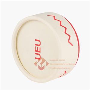
The colors are different from different products from various angles. Beautiful colors are still useful for the appearance of packaging designs. The purity and harmony of colors also need to be toned from a professional perspective, such as warm and cool colors.
There are requirements for reconciliation, which also needs to take into account the product attributes of packaging design. Different products pursue different color contrasts. This should be based on the attributes of the product to reconcile the colors. Both warm and cool colors must be adjusted. Contrast adjustment, according to different packaging design requirements to match the color of the product screen.
Looking at different materials, the color should also meet the material requirements of the packaging design. The main part of the vision still needs to be conveyed by the color. The contrast of the color is useful for the appearance of the packaging design. It should be considered that the overall match should meet the product The requirements of the color design.


